
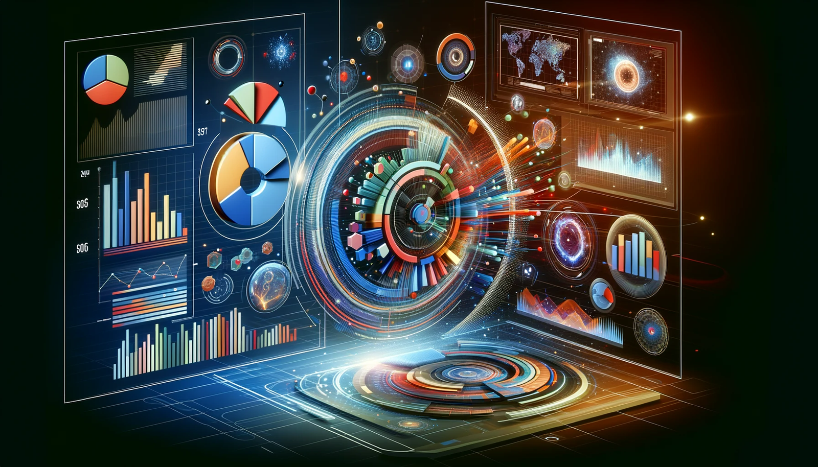
Making Sense of Big Data: A Beginner’s Guide to Data Visualization
Ever Wondered How to Make Sense of Lots of Data? Let’s Dive In!
In today’s world, we’re swimming in a sea of data. From the things we buy online to the shows we watch, there’s a ton of information out there. And guess what? Understanding this data is becoming super important in almost every job. That’s where data visualization comes in – it’s like a magic wand that helps us make sense of all these numbers and facts.
What Exactly is Data Visualization?
Think of data visualization as storytelling but with charts and graphs instead of words. It uses pictures to show what data means. It’s like when you see a weather map on TV; it’s much easier to understand the forecast when you see it in a picture, right? Data visualization does the same thing but can be about anything – from how many people buy a certain type of sneaker to how many folks are visiting a particular tourist spot.
This article from Forbes explains why understanding data is key in today’s job market.
Big Data and Visualization: A Match Made in Heaven
Imagine trying to read a phone book cover to cover (who does that, right?). Now, imagine if someone made a fun graphic showing the most common names or how many Smiths there are. That’s what data visualization does with Big Data – it takes heaps of information and makes it easy and even fun to understand.
The Good and Not-So-Good of Data Visualization
The Upside: Why We Love Data Pictures
- Catchy for the Eyes: We love colors and patterns. They grab our attention way more than rows of numbers.
- Quick Learning: A good chart can show us trends and exceptions super fast. It’s like getting the story without having to read the whole book.
- Sharing Made Easy: It’s simpler to share a cool graphic than to explain rows of data.
The Downside: Watch Out for These Traps
- Misleading Pics: Sometimes, the way data is shown can give the wrong idea. It’s like when a photo is taken from a funny angle – things can look different than they really are.
- Jumping to Conclusions: Just because two things are shown together, doesn’t mean one caused the other.
Why Data Visualization is Like a Superpower
Data visualization is important because it turns complex data into something we can all understand, no matter how much of a tech whiz we are. It’s used in almost every field you can think of – from science and government to arts and sports. It’s not just about making pretty pictures; it’s about making data tell a story.
Want to see how data visualization is used in different fields? Check out this interesting read from Tableau.
The Art of Turning Data into Stories
Data visualization is more than just making graphs look good. It’s about finding the best way to show data so it tells the right story. It’s a blend of science and art – you need to understand the data and know how to make it speak to people.
Types of Data Visualizations You Might See
- Charts and Graphs: Like bar graphs or pie charts. Simple but super helpful.
- Maps: Showing data based on places.
- Infographics: A mix of pictures and words.
- Dashboards: All your data visuals in one place.
There are loads more, each with its own way of showing data. Want to see some examples? Here’s a cool place to start.
Tools of the Trade: Data Visualization Software
There’s a bunch of software out there for making data visuals. Some are easy-peasy, and others are for the pros. But remember, it’s not just about the tool; it’s about how you use it to tell your data’s story.
Want to explore some tools? Gartner’s Magic Quadrant is a great resource to see what’s out there.
Learning Data Visualization: It’s Easier Than You Think!
Starting Your Journey in the World of Data Pictures
Curious about diving into data visualization? Great news – you don’t need to be a tech guru to get started. It’s all about learning to see the stories that numbers and figures are trying to tell us.
Step 1: Begin with the Basics
Start with the simple stuff. Get to know basic chart types like bar graphs and pie charts. They’re the bread and butter of data visuals and are super easy to understand. Think of them as the ABCs of data storytelling.
Step 2: Play Around with Tools
There are some great beginner-friendly tools out there where you can try creating your own visuals. Websites like Khan Academy or Coursera offer free courses to get you started. And the best part? You can experiment and learn at your own pace.
Step 3: Practice Makes Perfect
The more you play with data and try different ways of visualizing it, the better you’ll get. Start with data that interests you. Love sports? Look at player stats. Into cooking? How about visualizing recipe ingredients or cooking times?
Data Visualization: Not Just for Work
Here’s the cool part: data visualization isn’t just useful for your job. It can be a fun hobby, too. Imagine creating cool visuals of your budget or fitness routine and sharing them with friends. It’s a skill that’s useful and fun!
Where Can Data Visualization Take You?
In Your Career
In almost every job nowadays, knowing how to read and present data is a huge plus. Being able to explain complex ideas through simple visuals can make you a star in the workplace. You’ll be the one everyone comes to when they need to understand something quickly.
In Everyday Decisions
Believe it or not, data visualization can help in daily life, too. From planning your budget to understanding your health metrics, turning data into visuals can make decision-making so much easier.
The Future of Data Visualization
Guess what? Data visualization is just getting started. With advancements in technology, we’re going to see even cooler and more intuitive ways of presenting data. We’re talking about interactive graphs, 3D models, and maybe even data visuals in virtual reality!
Learning Resources to Dive Deeper
Hungry for more? There are heaps of resources online where you can learn more about data visualization. Websites like DataCamp and edX offer courses that range from beginner to advanced levels. And the best part? Many of these resources are free!
2 thoughts on “Data Visualization: Making Sense of Big Data”