

23 Best Data Visualization Tools for 2023
Data visualization is like turning numbers into stories. And with the right tools, you can paint those stories in vibrant colors and shapes that make sense to everyone. Let’s dive into the world of data visualization tools – the magic wands that turn complex data into easy-to-understand visuals.
What Is Data Visualization?
In simple terms, data visualization is about representing data graphically. Imagine trying to explain how sales varied over a year. A line graph could do that in a snap! It’s all about making data easily digestible.
What Are Data Visualization Tools?
Data visualization tools are the software and platforms that help you create these visual representations. From simple pie charts to intricate interactive maps, these tools are the artists behind the data art.
What Do the Best Data Visualization Tools Have in Common?
The cream of the crop in data visualization tools has a few things in common: user-friendly interfaces, versatility, and the ability to handle large datasets. Let’s explore some of the best ones out there!
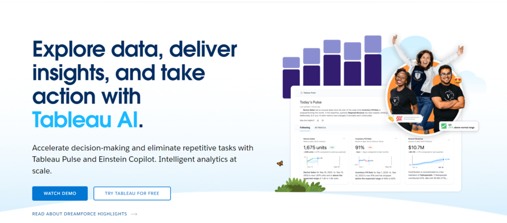
1. Tableau
Tableau is like the Swiss Army knife of data visualization tools. It’s powerful, intuitive, and can handle almost any data you throw at it. Perfect for both beginners and pros. Check out Tableau’s website for more.
Pros:
Tableau is renowned for its user-friendly interface and powerful analytics capabilities. It’s highly customizable and integrates well with various data sources.
Cons:
It can be expensive for small businesses and sometimes requires a steep learning curve for advanced features.
Verizon uses Tableau for business intelligence to analyze network performance and customer experience data.
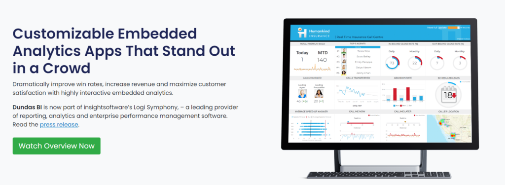
2. Dundas BI
Dundas BI stands out with its customizable dashboards and reporting tools. It’s great for businesses that need tailored solutions. More on Dundas BI here.
Pros:
Offers extensive customization and a responsive design for dashboards. It also provides excellent customer support.
Cons:
Can be overwhelming for beginners due to its vast array of features.
Coca-Cola Bottling Company consolidated its data from multiple sources using Dundas BI for better operational insights.
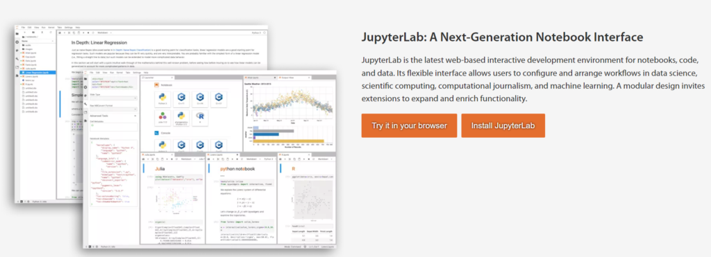
3. Jupyter
Jupyter is a hit among data visualizers, especially those who dabble in data science. Its notebooks make data analysis and visualization a breeze. Dive into Jupyter for more info.
Pros:
Great for data science applications, offering support for multiple programming languages. It’s open-source and allows for collaborative work.
Cons:
Less suited for non-technical users and lacks the advanced BI capabilities of specialized tools.
NASA uses Jupyter for data analysis and collaborative research across various space projects.
4. Zoho Reports
Zoho Reports is perfect for those who need a straightforward approach to data visualization. It’s part of the larger Zoho suite, making it ideal for integrated business solutions. Find out more on the Zoho website.
Pros:
User-friendly with a drag-and-drop interface. Offers robust integration with other Zoho apps and third-party services.
Cons:
Limited customization options compared to other tools. Some users report slow performance with large datasets.
Yamaha Motor uses Zoho for reporting and analyzing sales performance data.

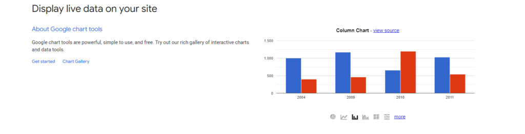
5. Google Charts
Google Charts offers a range of simple yet effective charting options. The best part? It’s free and web-based. Perfect for quick, effective visualizations. More at Google Charts.
Pros:
Free to use, integrates seamlessly with other Google services, and offers a wide range of chart types.
Cons:
Limited in terms of customization and data processing capabilities compared to more advanced tools.
Spotify uses Google Charts for analytics in its internal web applications.
6. Visual.ly
Visual.ly is a creative platform for custom data visualization examples. It’s more about creating stunning visuals that tell a story. Check out Visual.ly for inspiration.
Pros:
Great for creating visually stunning infographics and data presentations. User-friendly and ideal for content marketing.
Cons:
Not as powerful for complex data analysis and can be expensive for high-quality designs.
Audi used Visual.ly to create engaging infographics for its social media marketing.

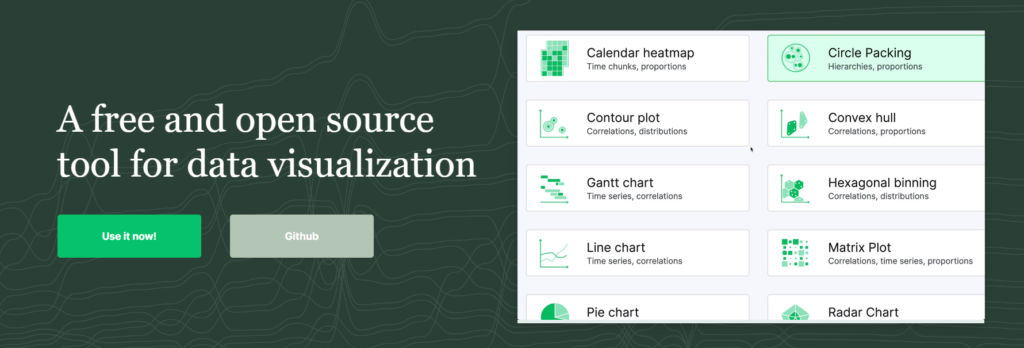
7. RAW
RAW is all about simplicity in creating complex charts. It’s web-based and free, ideal for beginners. Explore more at RAWGraphs.
Pros:
Excellent for creating custom visualizations without programming knowledge. Free and web-based.
Cons:
Limited in terms of data processing capabilities and lacks advanced analytics features.
Researchers use RAW for academic presentations and visualizing research data.
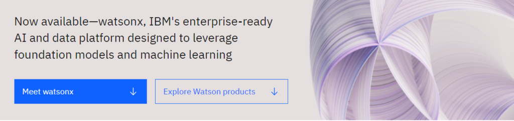
8. IBM Watson
IBM Watson is like the brainiac of data visualization tools. It’s powered by AI and offers advanced analytics. A deep dive into data visualization is available on IBM Watson.
Pros:
Integrates AI for advanced analytics and offers a robust set of features for business intelligence.
Cons:
Can be complex and overwhelming for beginners. High cost for small businesses.
The North Face uses IBM Watson for customer engagement and retail analytics.
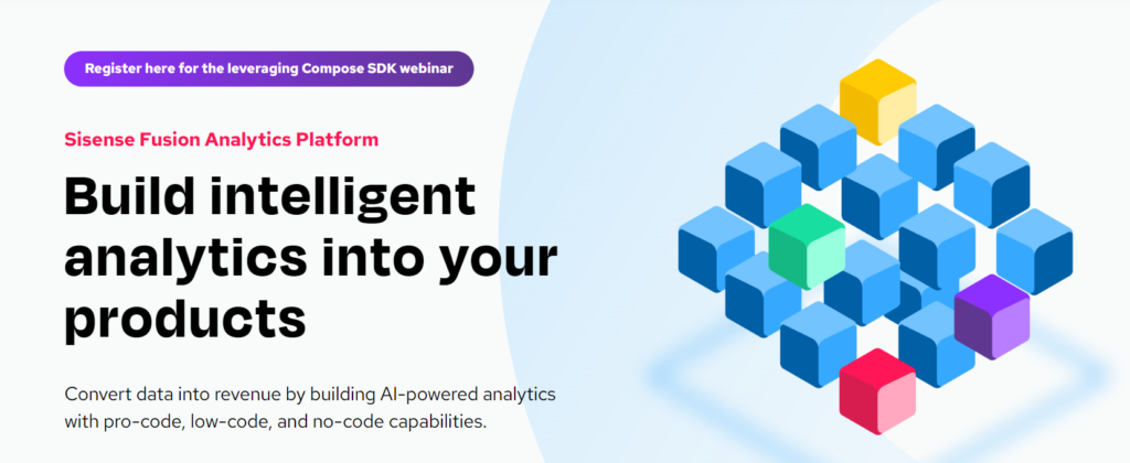
9. Sisense
Sisense is great for businesses that need to crunch large datasets. It’s robust and offers interactive dashboard capabilities. Learn more about Sisense here.
Pros:
Excels in handling large datasets and complex BI operations. Offers a wide range of visualization options.
Cons:
Setup and customization can be time-consuming. High costs can be a barrier for smaller companies.
Philips uses Sisense to integrate data from multiple sources for better healthcare analytics.
10. Plotly
Plotly is a favorite among coders. It’s versatile and works well with Python, R, and other scripting languages. For those who love coding their visuals, visit Plotly.
Pros:
Ideal for users comfortable with coding. Offers extensive chart types and interactive visuals.
Cons:
Requires programming knowledge, which can be a barrier for non-technical users.
The University of Oxford uses Plotly for scientific research visualization.

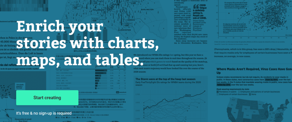
11. Data Wrapper
Data Wrapper shines in creating simple, elegant charts and maps. It’s web-based and user-friendly. Perfect for quick, clean visualizations. Explore Data Wrapper here.
Pros:
Great for journalists and bloggers due to its simplicity and effectiveness in creating charts and maps.
Cons:
Limited functionality for advanced data analysis and visualization.
The New York Times often uses Data Wrapper for visualizing poll and survey data in its articles.
12. Highcharts
Highcharts is known for its wide range of chart options and is especially good for web developers. Check out Highcharts for more details.
Pros:
Offers a wide range of interactive chart options and is easy to integrate with web projects.
Cons:
Requires JavaScript knowledge for customization. Licensing can be costly for commercial use.
Twitter utilizes Highcharts for visualizing user interaction data on its platforms.
13. Fusioncharts
Fusioncharts offers a vast array of chart types and is known for its ease of integration with various platforms. More on Fusioncharts can be found here.
Pros:
Widely used for its ease of integration and a large variety of charts and maps.
Cons:
Can be expensive for small businesses and startups. Requires basic coding for customization.
LinkedIn uses FusionCharts for internal data visualization and reporting.
14. Power BI
Microsoft’s Power BI is a powerhouse, especially for those embedded in the Microsoft ecosystem. It’s great for business analytics. Dive into Power BI on their official site.
Pros:
Integrates seamlessly with Microsoft products. Offers a comprehensive set of BI tools and visualizations.
Cons:
Can be less intuitive for non-Microsoft users. Advanced features require a subscription.
Adobe Systems uses Power BI for business analytics and data management.

15. QlikView
QlikView is all about guided analytics. It’s intuitive and allows for deep dives into data. Learn more about QlikView at Qlik.
Pros:
Known for its associative model which allows for flexible, on-the-fly data exploration and visualization.
Cons:
The steep learning curve for new users. Can be resource-intensive on large datasets.
Panasonic utilizes QlikView for sales and marketing analytics.

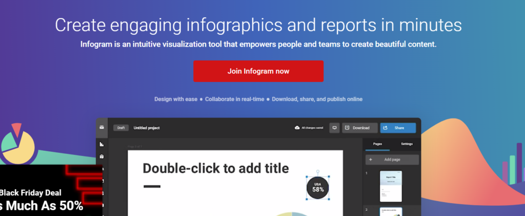
16. Infogram
Infogram is perfect for creating infographics and simple charts. It’s user-friendly and web-based. Ideal for those looking to add a creative touch to their data. Check out Infogram.
Pros:
User-friendly with a focus on creating engaging infographics and interactive reports.
Cons:
Limited in terms of deep data analysis capabilities. Premium features come at a cost.
The United Nations uses Infogram for presenting global data and statistics.
17. ChartBlocks
ChartBlocks is a straightforward chart builder that’s great for beginners. Its drag-and-drop interface makes it super easy to use. More about ChartBlocks at their website.
Pros:
Easy-to-use online chart-building tool, ideal for beginners and those with limited technical skills.
Cons:
Limited customization and scalability for larger, more complex datasets.
Small businesses and educational institutions use ChartBlocks for simple data presentations.

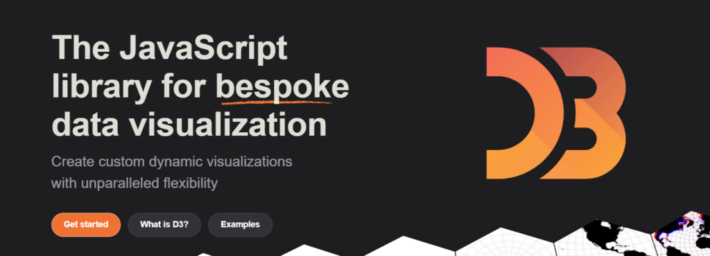
18. D3.js
D3.js is for those who love to code. It’s a JavaScript library that allows for creating dynamic, interactive data visualizations in the web browser. Explore more on D3.js.
Pros:
Offers full creative control for web-based data visualizations. Highly flexible and powerful.
Cons:
Requires strong JavaScript skills and can be time-consuming for complex visualizations.
The New York Times leverages D3.js for interactive storytelling and data journalism.
19. Chart.js
Chart.js is another great library for web developers. It’s simple yet powerful, perfect for creating animated charts. Learn more about Chart.js here.
Pros:
Simple yet flexible JavaScript charting for designers and developers. Good documentation and community support.
Cons:
Limited to charting without advanced analytics features.
Small web development projects often use Chart.js for adding simple, interactive charts to websites.
20. Grafana
Grafana is known for its real-time dashboards, making it a go-to for monitoring and time series analytics. Dive into Grafana at their site.
Pros:
Excellent for time-series analytics, monitoring, and alerting. Open-source and highly customizable.
Cons:
Can be complex to set up and configure, especially for larger deployments.
Wix.com uses Grafana for website performance and user behavior analytics.

21. Chartist.js
Chartist.js offers responsive charting. If you’re into making charts that adapt to different screen sizes, this is for you. Check out Chartist.js.
Pros:
Offers responsive charts that adapt well to different screen sizes. Simple syntax and is easy to get started with.
Cons:
Not as feature-rich as other charting libraries. Best suited for basic visualizations.
Freelance web developers and bloggers use Chartist.js to add responsive charts to their content.
22. Sigma.js
Sigma.js is perfect for graph drawing, especially when dealing with large networks of data. It’s interactive and open-source. More on Sigma.js can be found here.
Pros:
Specializes in graph drawing, perfect for representing large networks of data. Open-source and customizable.
Cons:
Requires good JavaScript knowledge and may not be suited for general-purpose charting.
Academic researchers use Sigma.js for visualizing complex network data and relationships.
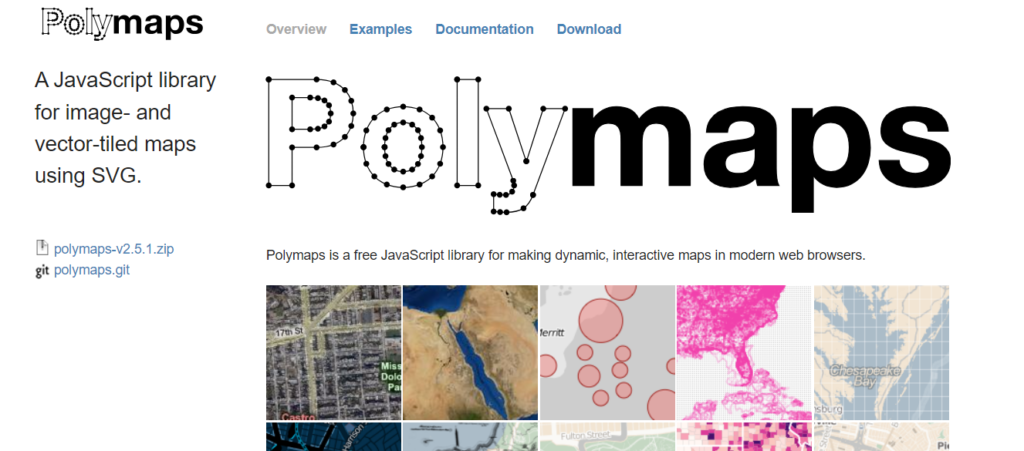
23. Polymaps
Polymaps is a JavaScript library for image- and vector-tiled maps. It’s fantastic for creating dynamic, interactive maps. Explore Polymaps at their website.
Pros:
Ideal for creating dynamic, interactive maps. Integrates well with various data sources.
Cons:
Geared towards developers with a focus on geographic data, which might not suit all users.
Urban planners and geographers utilize Polymaps for mapping urban data and geographical studies.
Choose the Right Program
Choosing the right data visualization software depends on your needs. Are you a coder? A business analyst? Or maybe a creative storyteller? Pick the tool that aligns with your skills and requirements.
Learning Data Visualization Tools to Further Your Career
Learning to use these tools can be a game-changer for your career. Whether you’re in marketing, finance, or any field that deals with data, knowing how to visualize data effectively is a skill that’s in high demand.
FAQs
Q: Do I need to be a coder to use these tools?
A: Not necessarily. Tools like Tableau, Infogram, and Google Charts are very user-friendly and don’t require coding skills.
Q: Are these tools expensive?
A: It varies. Some tools offer free versions with limited features, while others may require a subscription. Many have trial periods, so you can try before you buy.
Q: Can these tools handle big data?
A: Yes, many of these tools are designed to handle large datasets efficiently. Tools like Sisense and Power BI are known for their big data capabilities.
There you have it – a rundown of the 23 best data visualization tools for 2023. Whether you’re a seasoned data analyst or just starting out, there’s a tool out there that’s perfect for you. Happy visualizing!